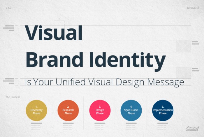
Developing a Visual Brand Identity dives into the essence of creating a strong and memorable brand image that resonates with your audience. From color schemes to typography, this journey explores the key components that shape a cohesive brand identity.
As we unravel the significance of visual assets and the importance of consistency in brand elements, you’ll discover how to adapt your brand for various platforms while maintaining its core identity.
Understanding Visual Brand Identity

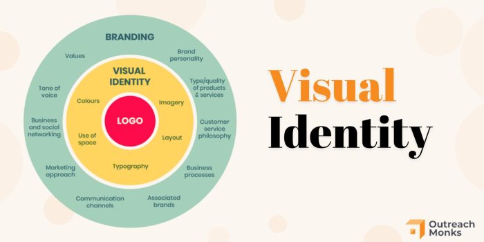
Visual brand identity encompasses the visual elements that represent a brand, such as logos, colors, typography, and imagery. These elements work together to create a unique and recognizable look and feel for a brand.
A strong visual brand identity is important because it helps a brand stand out in a crowded market, build recognition and trust with customers, and communicate the brand’s values and personality effectively. Consistency in visual branding also helps to create a cohesive and professional image for a brand.
Examples of Successful Visual Brand Identities
- Apple: Known for its minimalist and sleek design aesthetic, Apple’s visual brand identity is instantly recognizable and reflects the brand’s focus on innovation and simplicity.
- Nike: With its iconic swoosh logo and bold use of the color red, Nike’s visual brand identity conveys a sense of energy, athleticism, and empowerment.
- Coca-Cola: Coca-Cola’s classic red and white color scheme, along with its timeless logo design, have made it one of the most iconic and enduring visual brand identities in the world.
Components of Visual Brand Identity
Visual brand identity is made up of several key components that work together to create a cohesive and recognizable brand image. These components include color schemes, typography, logos, imagery, and overall design elements.
Color Schemes
Color schemes play a crucial role in visual brand identity as they help evoke emotions, convey messages, and create a memorable brand image. Different colors can be associated with specific traits or values, and using a consistent color palette across all brand materials helps in building brand recognition and establishing a strong visual identity.
- Primary colors: These are the main colors that represent the brand and are used consistently across all branding materials.
- Secondary colors: These are additional colors that complement the primary colors and add depth and variety to the brand’s visual identity.
- Accent colors: These colors are used sparingly to highlight important elements and create visual interest.
Choosing the right color scheme is essential for creating a strong visual brand identity that resonates with the target audience.
Typography
Typography refers to the style, size, and arrangement of text used in branding materials. The choice of fonts and typography plays a significant role in conveying the brand’s personality, values, and overall message. Consistent typography helps in creating a cohesive brand identity and ensures that all brand communications are easily recognizable.
- Font selection: Choosing the right fonts that align with the brand’s tone and message is crucial for creating a cohesive visual identity.
- Font pairing: Combining different fonts to create hierarchy and visual interest while maintaining consistency in branding materials.
- Text arrangement: Proper spacing, alignment, and layout of text contribute to the overall readability and visual appeal of brand materials.
Typography plays a vital role in creating a memorable and impactful brand identity that resonates with the target audience.
Developing a Brand Style Guide: Developing A Visual Brand Identity
Creating a brand style guide is crucial in maintaining consistency and cohesiveness in visual branding efforts. It serves as a reference point for all visual elements associated with a brand, ensuring that they are presented in a uniform and recognizable manner across various platforms.
Purpose of a Brand Style Guide, Developing a Visual Brand Identity
A brand style guide helps establish the visual identity of a brand, including its logo, color palette, typography, imagery, and other design elements. It ensures that all marketing materials, both online and offline, adhere to the brand’s established guidelines, reinforcing brand recognition and trust among consumers.
- Logo Usage: Guidelines on proper logo placement, sizing, and clear space requirements.
- Color Palette: Defined colors and their specific usage, including primary, secondary, and accent colors.
- Typography: Approved fonts, sizes, and styles for all written content associated with the brand.
- Imagery: Guidance on the type of images or graphics that align with the brand’s visual language.
- Design Elements: Consistent use of shapes, patterns, and other visual elements that reflect the brand’s identity.
Tips for Creating a Comprehensive Brand Style Guide
When developing a brand style guide, consider the following tips to ensure it is comprehensive and effective:
- Start with Brand Research: Understand the brand’s values, target audience, and overall identity to inform the style guide.
- Define Brand Elements: Clearly Artikel the logo variations, color codes, typography details, and design elements to be used.
- Provide Usage Examples: Include visual examples of correct and incorrect applications of brand elements to guide users.
- Update Regularly: As the brand evolves, make sure to revisit and update the style guide to reflect any changes or additions.
- Get Feedback: Collaborate with stakeholders and designers to gather feedback and ensure the guide is practical and user-friendly.
Creating Visual Assets

When it comes to creating visual assets for a brand, one of the key elements is designing a logo that effectively represents the brand’s identity. A logo is often the first thing that comes to mind when people think of a brand, so it needs to be memorable and reflective of the brand’s values and personality.
However, visual assets go beyond just a logo. They encompass a wide range of design elements that help create a cohesive brand identity and leave a lasting impression on consumers. These assets can include color schemes, typography, imagery, patterns, and other visual elements that are used consistently across various brand materials.
Significance of Visual Assets
- Visual assets help to establish brand recognition and differentiate a brand from its competitors.
- They create a sense of visual unity and consistency across all brand touchpoints, from marketing materials to product packaging.
- Visual assets evoke emotional responses and help to communicate the brand’s values and messaging effectively.
Examples of Visual Assets
- Color Palette: A carefully chosen color palette can evoke specific emotions and associations tied to the brand. For example, the use of red can convey energy and passion, while blue may represent trust and reliability.
- Typography: The choice of fonts and typography styles can help reinforce the brand’s personality and tone. Whether sleek and modern or traditional and elegant, typography plays a crucial role in brand communication.
- Imagery: From photography to illustrations, visual imagery can be a powerful tool in conveying the brand’s story and connecting with the audience on a deeper level. Consistent use of imagery can help reinforce brand identity and messaging.
Consistency and Adaptability
Maintaining consistency across all visual brand elements is crucial for building brand recognition and trust. Consistency helps create a cohesive and unified brand image that customers can easily identify and connect with. On the other hand, adaptability is essential for ensuring that the visual brand identity can be effectively utilized across different platforms and mediums to reach a wider audience.
Importance of Consistency
Consistency in visual brand elements such as colors, fonts, logos, and imagery helps reinforce brand recognition. When customers see consistent visuals across various touchpoints, they are more likely to remember and trust the brand. Consistency also reflects professionalism and attention to detail, which can enhance brand credibility.
- Use a brand style guide: Create a comprehensive brand style guide that Artikels specific guidelines for using visual elements. This guide should cover everything from color codes to logo placement to maintain consistency.
- Regularly audit brand visuals: Conduct regular audits of all visual materials to ensure they align with the brand guidelines. This includes checking websites, social media profiles, marketing collateral, and any other brand touchpoints.
- Train team members: Educate employees, partners, and vendors on the importance of brand consistency and provide them with the necessary resources to adhere to brand guidelines.
Adaptability Across Platforms
Adapting a visual brand identity for different platforms and mediums involves tailoring the brand visuals to suit the specific requirements and limitations of each channel. This can include adjusting image sizes, layouts, and color schemes to ensure brand consistency while optimizing for each platform’s unique characteristics.
- Responsive design: Ensure that brand visuals are designed to be responsive and adaptable to different screen sizes and resolutions, especially for digital platforms like websites and mobile apps.
- Customize for each platform: Customize visuals for specific platforms while maintaining core brand elements. For example, create variations of social media profile pictures and cover photos that are optimized for each platform’s dimensions.
- Consider user experience: Keep in mind the user experience when adapting brand visuals for different platforms. Focus on creating a seamless and consistent brand experience across all touchpoints.